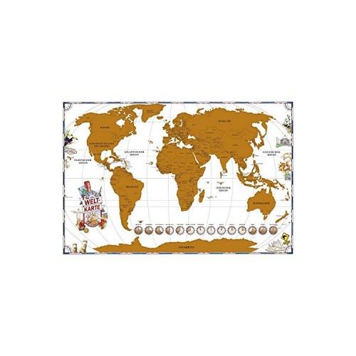
However, there are on the map also criticize some:
- The world's oceans in the background are white. Why do you do it not blue?
- The map is very approximate. There are only drawn capitals. I have a normal map in a similar size, and there are still more large / major cities and rivers drawn which also missing on this map.
- Below you can see watches that symbolize the time difference in different locations. However, I could not tell what principle they are positioned. It would make sense, in my opinion, they draw in the longitudes, where the towns.
- The card must be placed on a solid, smooth surface to scratch off. Etc. For rough walls so you have to take it off to reveal a new location after a trip.
In summary: nice idea, but not a good design, I think.