The most off-putting to me the point is certainly the font. Yes I know it does not look anything like that but let me explain ... She who must provide support for the River discourse knocking but if convoluted that it becomes grotesque is a very ugly banality. One has the impression of reading italics permanently, it is anything but pleasant. Moreover, as contradictory as it may sound, I think there is not enough written in this book. We find of course the abundant verve Achilles but even if it lacks quality, it has a taste of too little and lefuneste no longer seems an opponent to the height so his prose seems low in comparison and less supported.
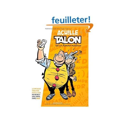
The drawing is itself an unusual, although successful. It does not stand out enough for my taste other standard productions. Obviously, one can not ask someone to repeat exactly like its predecessor but modernizing a comic is anyway difficult and Achille Talon would fully deserved to retain a graphic feature, either in the use of colors more trenches or greater use of the color black. I am not a professional but it seems to me that there is still room for improvement there.
So yes, of course I smiled a few times and I can not say I did not like this book. 3 stars mean "like" all the same! I even reread to try to pass this disappointing first impression and I admit it is a bit diminished. But I just hope that the next volumes do not stagnate the simple fact to confront Achilles Heel in the modern world. This is not a subject enough to live up to this rotund and biting character.