
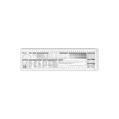
"XXL" on behalf of the Typometer I think is exaggerated. The cm-scale only goes up 35cm. That's not really much more than A4. Here I would have liked at least 43cm / A3. So rather "L" instead of "XXL".
The Kunsttoff used is quite thick. This may on the one hand be good for the stability, on the other hand, the exact measuring of sizes is complicated significantly. The drops me at my old Typometer significantly lighter (but also partly because here the printing in lower contrast blue and thus is not full coverage).
It lacks a line counter
There is no guidance. Although much self-explanatory, maybe some information / tips for the one or other customer would be helpful.
Fonts / DIN 16518? Who needs that? Really no better idea of how to use the space on the ruler better?


![TuneUp Utilities 2014-1 Square [Download] (Software Download)](https://img.tgreer.com/thumb/85x85/0/32/03267b900b3886de4facc141bde9da2a.jpg)


