
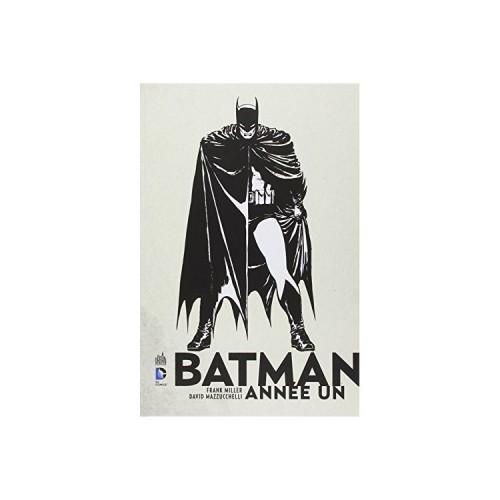
The story everyone knows Bruce Wayne returns from his years of training abroad to fight crime in Gotham City. What makes this version of its remarkable and essential roots is the combination of two exceptional talent at the top of their game. Frank Miller to the brilliant idea to put facing the tribulations of a Batman fumbling with the arrival of James Gordon in Gotham font. This story follows the two men during the first year of their return to Gotham. Bruce Wayne is experimenting to find the most effective modus operandi for the fight against crime (suit, relations with the police, tactical ...) and James Gordon collides with corruption and responsibility to become a father in a city inhospitable.
Frank Miller carried the story from the point of view of its two main characters. Additional information is delivered through flashes of TV information (trick already used in Dark Knight, but much better controlled here). It's history is proof of Miller's talent: she appeared in 1987 in 4 episodes (Batman 404-407) and contains all the basics of the myth as it is still valid today in continuity. With this single volume, you will finally know the relationship between Selina Kyle and Holly Hunter, Catwoman and Batman, James and Sarah Essen Gordon, Harvey Dent and Bruce Wayne. From beginning to end, Frank Miller picked up a scenario unfolds on a narrative without any dead time and with complete empathy with its characters.
The choice of David Mazzuchelli is of exceptional relevance. As opposed to the Dark Knight is a flamboyant narrative and diehard, Year One is very down to earth and factual. It's almost press reports various facts. The detailed and realistic style Mazzuchelli is in perfect harmony with the tone of the story. Each character is recognizable and credible, each decor is thought like a decorator or a planner. Choosing a style applied and while retained rather than demonstrative admirably serves the story. And the look is struck by the likelihood of interiors (the furniture is not arranged at random, but as in an ordinary inside). The work of the designer is beautifully complemented by the color layout Richmond Lewis. The colors were done on the occasion of the first edition in the collection. Richmond Lewis uses a deliberately limited palette few neutral colors it comes in subtle shades. The objective is the same as the style of illustrations: emphasize this very ordinary sensation, and escape the big show. It authorizes only on rare occasions to show the extent of his talent: a carpet with it and a great pair of sheets per one (last frame of the third episode).
All these advantages make Year One subtle and nuanced narrative opposite of a big budget movie and great show. The humanity of each character and motivations are thereby magnified. And every rereading (I have ten on the clock) transports you again and every time in the difficulties and the difficult choice of these heroes (Wayne and Gordon) very human.


![Project CARS - [Xbox One] (Video Game)](https://img.tgreer.com/thumb/85x85/7/c0/7c0d13927791ad1e.jpg)


![Middle-earth: Shadow of Mordor - [PlayStation 4] (Video Game)](https://img.tgreer.com/thumb/85x85/2/3a/23a4d0ef19f280b0.jpg)


